
Better Place Forests
When we talk about startups, we’re most often about to jump into a discussion of a new app or service or product meant to make everything faster and easier. And when we talk about death, we’re often avoiding the ultimate inevitable and sidestepping hard conversations.
So what do we do, and how do we talk about a startup that works in the end-of-life experience? Can death be disrupted?
Better Place Forests is injecting optimism, imagination, and joy into end-of-life planning. In a growing network of forests around America, Better Place Forests offers individuals and families the chance to select a private tree in a beautiful, protected forest. These trees—noted with an engraved marker and along accessible trails and pathways—become living, lasting memorials. Personalized ceremonies and gorgeous visitor centers are enhanced more through impeccable service from their team, including expert forest stewards.
They wanted their new website to not just educate potential consumers about alternatives to traditional burials but bring a fresh, compelling voice to the conversation around end-of-life planning. Better Place Forests wants to offer more than private memorial trees. They want to be seen as an expert resource in intentional planning.
We planned an intensive day-long workshop onsite with the Better Place Forests team and the Make&Model team. This time did double duty getting our team up to speed and building essential trust between client and creatives. Exploring everything from origin story to future goals to current pain points with customer education and.
Part of our workshop zeroed in on messaging. We needed to tow a narrow line between a brand being seen as novel and experienced, new and vetted. Creative and credible. Respectful and innovative. In the meeting and follow up conversations, we explored when and where humanity and humor make sense, and when a just-the-facts approach would work better.

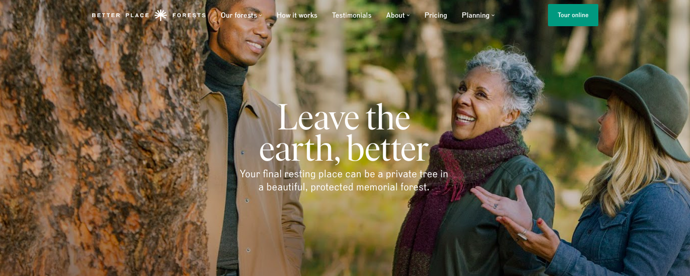
Oh, how I wish I could take credit for that tagline! The subhead needed to introduce the complete concept after an emotional, clever lead-in.
Ideation and co-creation alongside the brilliant UX designer Sarah Jutras meant each page was planned to be both emotive and efficient. The visitor flow was considered from someone coming in curious to the homepage or moving with intent through a lead generation on Facebook or geolocated landing pages.
Thorough review with the Better Place Forest team and repeated user testing ensured messaging did its intended double, even triple, duty.
Copy needed to educate people just beginning the journey towards planning. Funerals and burials are expensive, and the investment is one not made lightly. The sticker shock of a traditional burial can be intense, so introducing an alternative needed to be done with that potential surprise in mind.
For those ready to make momentous decisions, copy needed to inspire, to reflect the potential of a reimagined memorial.
And for folks at any stage, the process and pricing needed to be clearly communicated so as not to confuse.
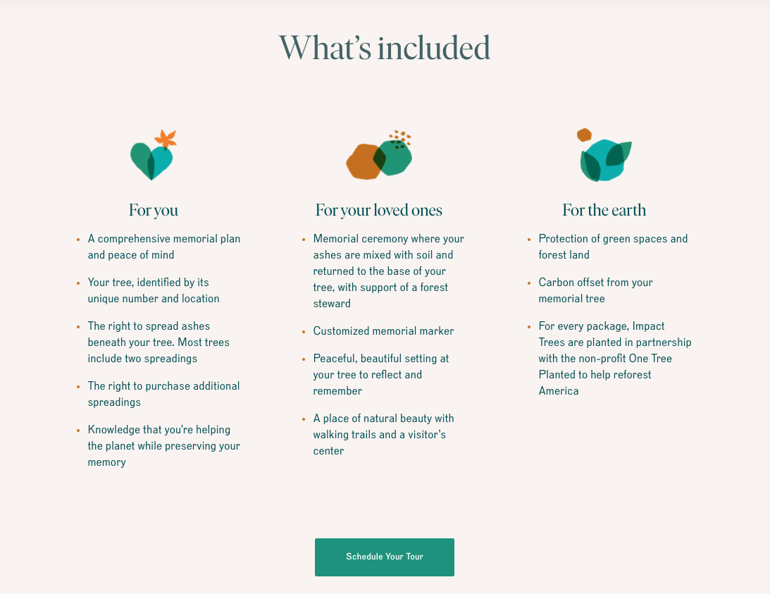
A scroll initiated animation reveals how Better Place Forests serves individuals, their loved ones, and the earth.
Product information is an essential part of any new launch.
For Better Place Forests, consumer education takes on many roles. Potential customers likely haven't heard of a memorial forest (and rightly so, these are a first of their kind!)
They want to know how forests are purchased and protected.
They want to understand just what the tree selection process is.
Then they want to know everything that happens after they pass. How does it all work? How will their family and loved ones gather? What happens in the future?
Only a carefully mapped How It Works page could do the trick in educating and inspiring consumer confidence. Broad, actionable steps are introduced for the casual skimmer. For the curious consumer, each step is broken out, often with links to even more detail.
Site visitors learn a bit about Better Place Forest, what to expect in an online tour, how memorial services work, and what kind of impact they can have on the earth.
An evocative founding story, a team of passionate team members, and a compelling mission make for great brand storytelling.
Creating a robust About page, with subsections that explore the roles various team members play from forest steward to customer success helps showcase culture and community. Telling the company's Why and showing how they put their mission into responsible action builds credibility in a space not used to startups.
Deeper content on the team, the company mission, and the process of creating a memorial forest was available by scrolling down in each page subsection.
A major concern for the Better Place Forests team is the fact that the end-of-life industry is seen as confusing and full of add-ons, during a decision making process that is already emotional.
They wanted to respectfully help consumers understand the costs and limitations of the traditional experience. Transparency and ease-of-understanding were top of mind.
Planning, designing and writing the Pricing page was an incredibly thoughtful, collaborative process. At every step we assessed whether decisions would help and empower consumers.

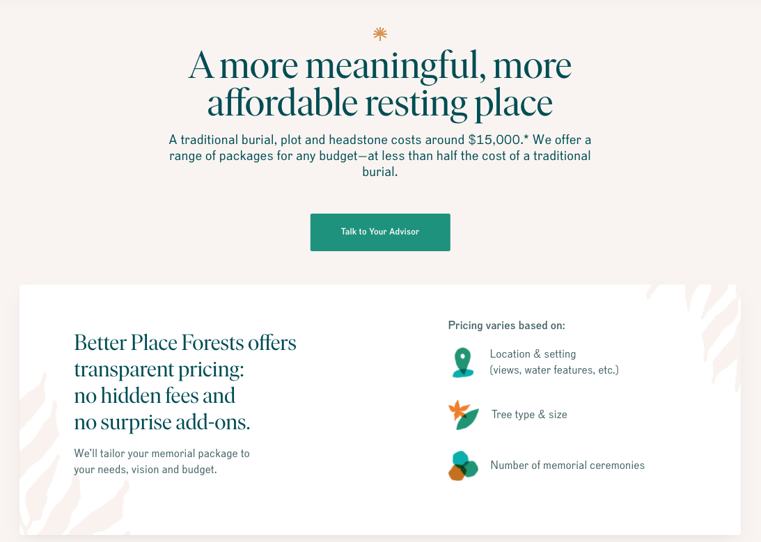
Most people don't know the average cost of a traditional consumer. Starting there was essential but meant sharing without shocking. After all, this is about creating a more positive experience.

For potential consumers who come directly to pricing or to reinforce messaging, we echoed the benefits from the homepage in a new way.
The new Better Place Forests website needed to do many things well. It needed to guide Boomers and Gen Xers curious about alternative memorials to take an online tour. It needed to build credibility for a new approach in a staid, traditional industry. It needed to communicate the inspired vision of a team hoping to change the way we talk about and experience end-of-life planning.
The end result is a gorgeous journey through the possibilities of a preserved, memorial forest and a welcoming invitation to learn more.